
Carbon For Android is a prime example of a really good Twitter client for an app that’s not yet on an iOS device. Sure, Android has a certain stigma attached to its app “design” tendencies, but Carbon shirks those norms and provides some insight into exactly what Twitter should be thinking about for its next iOS app release. This app is very minimalistic, sleek, and intuitive. It’s a little weird to be so excited for an app that doesn’t do something new — but rather, completely changes the way you do it. Carbon is this pretty stellar Twitter app.
Most iOS Twitter users have already made the switch from the official client to something like Tweetbot or Twitterific. And while these paid apps are awesome and make Twitter way more operable on mobile devices, they don’t yet have the sleek, sexy, and minimal feel of Carbon. Don’t get me wrong, they’re definitely crème of the crop, but if you’re into minimalism, they’re likely not for you.
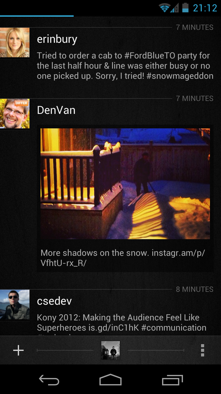
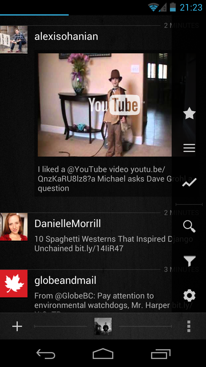
Carbon is made by Dot Lines and really makes use of a a simple design and intuitive touch features that really showcase the content and not the app. You’ll consistently notice how much of the app isn’t really there, but you can still do what you wanted to get done. Any media, pictures and video are automatically shown directly in the feed, and occupy more screen real estate than a small thumbnail. The media shines through.
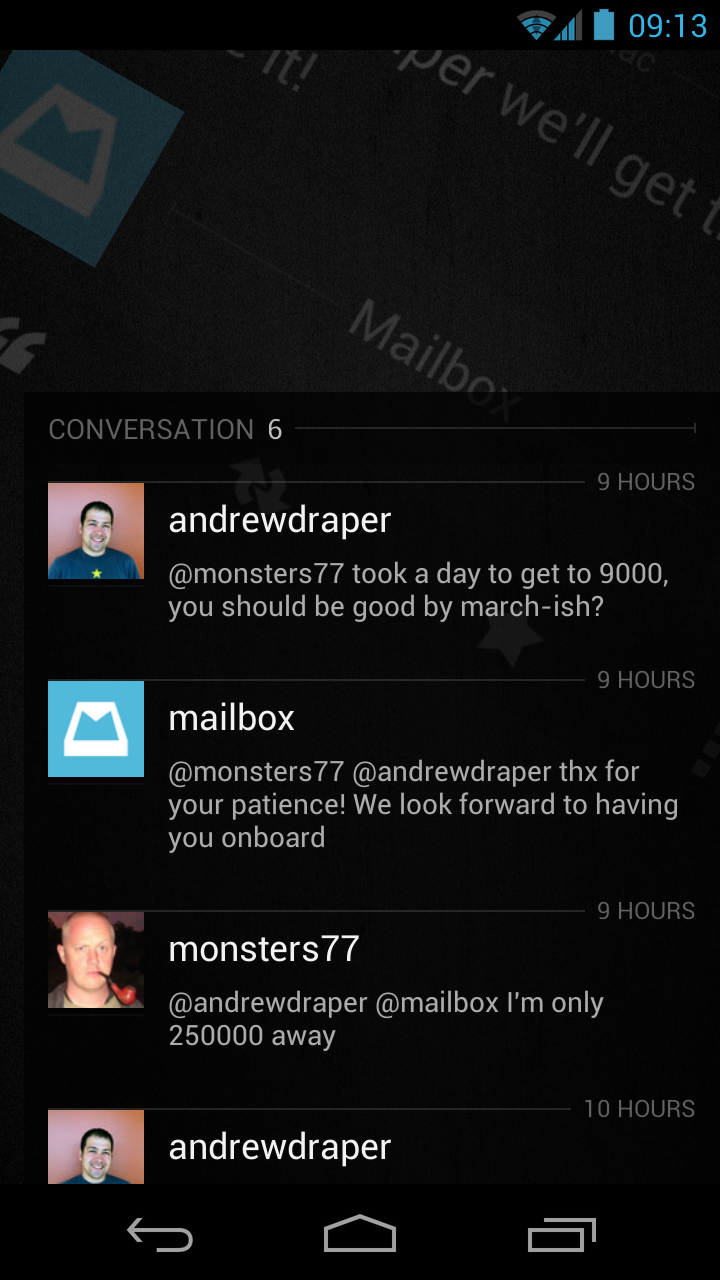
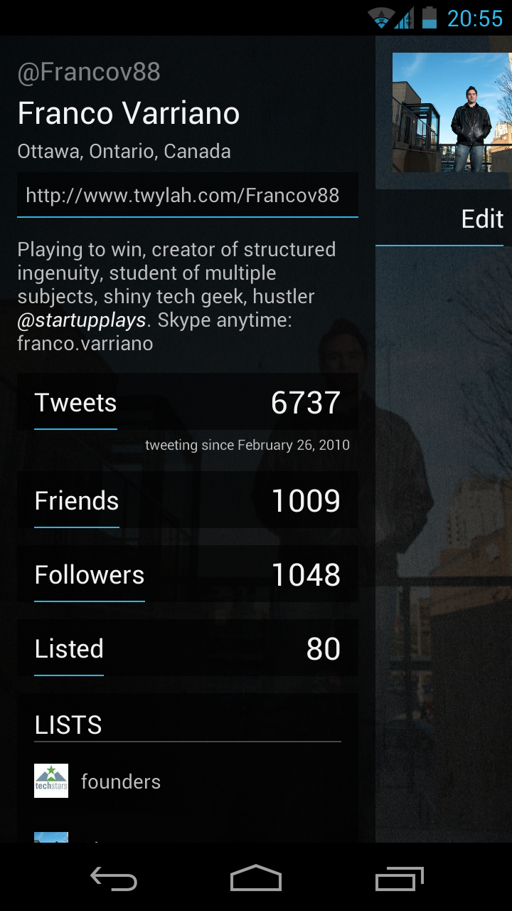
Tapping on a particular tweet will enable access to your favorites, retweets, or quotes, as well as give you a visual on the conversation happening around your posts. Swiping side-to-side easily gets you to your mentions and direct messages. Pulling up the options and profile menus creates a smooth overlay over the feed so you can easily swipe them away to get back to reading your Tweets.
This app definitely has its stuff together. It flows seamlessly and really makes tweeting from mobile an exhilarating experience. It’s so good, I would have paid for it if it weren’t already FREE!
So dear Twitter iOS team engineer that’s reading this, make sure you take note of what’s raised the bar: minimalistic design, simple swipe and touch navigation, emphasis on all content, no matter the source, and the lack of big, chunky/clunky buttons.
It was a no brainer for me to replace the native Twitter Android app with this beautiful creature. The only thing that’s missing is iOS support so I can use it between devices and on the bigger iPad screen.


