
This morning, the Spotify app on my MacBook Air alerted me to a new version and that I should restart the app to upgrade. So I did. And I was presented with a totally different looking app on the flip side. Gone were the various shades of light and medium gray; in its place stood a slick, black interface with white text and green accents. Surprise!
The new look may have been unexpected for many Spotify users—just do a search for “new spotify” on Twitter—but the company actually started rolling it out on April 2nd. The update isn’t just a new look, though: It also features a new Album view that, well, lets you view your music as grouped by album.
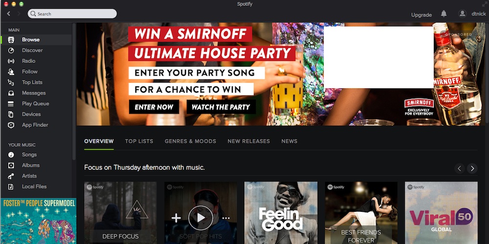
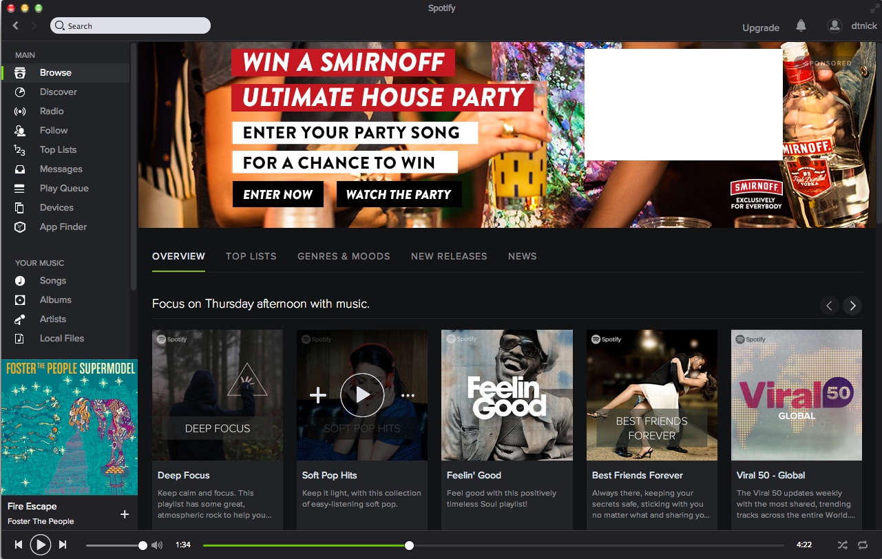
Spotify says it’s also working on improvements to the app’s Browse feature to provide ” even more relevant and localised content.”
“[R]egardless of whether you’re looking for something to fall asleep to, or the perfect playlist to get you geared up for your big night out, finding the right music for every moment is easier than ever,” the company posted on its blog.
Like the new Spotify? Hate it? Don’t care? Tweet us @macgasm and share your thoughts with us.


