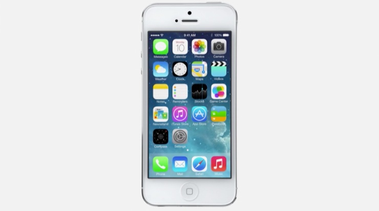
According to The Next Web, the icons used in iOS 7 were designed by Apple’s print and web marketing team, and will most likely be changed around before the official release of iOS 7 this fall. The publication has received this information from “multiple sources” and The Next Web has learned that Ive, Apple’s head of software and hardware design, brought the team together and gave them the color pallets used within the applications to use as a guide for design.
The Next Web goes on to write that there wasn’t a lot of communication going on between the teams, hence making for inconsistency within the icon designs. The publication has stated, however, that these icons are still a “work in progress” and that the current state of iOS 7 is a “‘mid stride’ snapshot.” In fact, some have reported seeing newer builds of iOS 7 being used on stage at WWDC rather than the build that is currently in the hands of developers.
Matthew Panzarino has stated that he thinks that the iOS 7 beta period will see more changes than any other iOS beta we’ve seen in the past. I would have to agree, and honestly, I think it should be expected. This is due to the fact that iOS 7 is the first time that iOS has received a full UI overhaul (in seven months no less), so there’s inevitably going to be some trial-and-error involved with the redesign and development process.
Via: MacRumors


