Apple devices “just work” right out of the box. Every step of the first experience with an Apple computer is designed to teach you how to use it. The iPhone, a candidate for Most Useful Device Ever Invented, only comes pre-loaded with a few applications, but those few are enough to do the trick.
But the best part about the iPhone is that it’s extensible. The Springboard interface and the App Store software business are a perfect match. They’ve made apps more popular than songs in iTunes. Think of that!
Table of Contents
The most physical computer ever
iOS imposes the right kinds of constraints. It’s a grid of icons, and we tap, hold and drag them. They’re almost like real objects. By seamlessly linking the software to our fingers, and by traveling with us in our pockets, the iPhone is the most physical computer ever. It’s more like a real, human tool than any computer before it. And thanks to the App Store, it can be endlessly customized to fit our needs.
But we aren’t used to thinking about computers that way. If we forget that the iPhone is a physical tool, it can end up a mess. Too many apps and not enough thought can turn its helpful constraints into a handicap. Does that sound familiar to you?
I’ve spent way too much time solving this problem. Fortunately, now I waste almost no time on my phone, because it’s configured perfectly. Whenever I spring for a new app or need to make an adjustment, the change is minimal, and it follows a plan. Here are the three steps I use to tune my iPhone:
1. Identify the jobs you want your phone to do.
This is the fun part. What do you want your phone to be for? Photography? Reading? Twitter? Writing? Making music? Watching TV? The iPhone can do all of these things. Start by making a list, and make it exhaustive. It will also help to put the list in order. Prioritize these tasks, so you know their order of importance. If it’s a tie, don’t worry. Just take a stab at it.
This is my list:
- Communication (via iMessage, social networks and phone)
- Day planning (calendar, to-dos, weather, maps)
- Reading (via RSS and Twitter, filtering down to Instapaper)
- Photography
- Short writing, drafts, and notes
- Interaction with Mac (file sharing, remotes, etc.)
- Fun, games, etc.
2. Find the minimum number of apps you can use to accomplish these tasks.
This is the hard part. You have to use some combination of browsing, recommendations, and trial and error to find the best apps to do the job. Some will be free, and some will cost money. Sometimes, you’ll need the best app, period. Other times, you’ll want to compromise with a free app for a low-priority task. That’s fine. The goal here is to get the most done with the fewest apps.
Why have tons of apps that overlap or do the same things? When you’re not settled on one workflow yet, it’s fine to keep switching things up and trying different solutions. But the goal should be to find the one that works best for you and delete the rest.
Remember, the iPhone is a physical computer. Apps literally take up space — not just disk space, but grid space. You don’t want to be swiping through eight home screens. Narrow down the app roster as much as possible until you’ve got the essentials.
3. Arrange your apps according to function, ergonomics and aesthetics (in that order).
This is the OCD part. Now that you’ve got all the apps you need — and nothing more — it’s time to arrange them. Remember these three principles: function, ergonomics, and aesthetics. The first priority should be getting to the apps you need. The next should be not spraining your thumbs. There’s a reason why the iPhone has a 3.5-inch screen: It’s for doing things with your fingers, not just watching Avatar. Do you have a 5-inch thumb? I don’t.
The aesthetics are where we Apple geeks get made fun of by the green-text-on-black-screen crowd. But it’s essential. It’s the least essential of the three essentials, but you have to factor it in. As ergonomics are to your thumb, aesthetics are to your eyes. In order to use the iPhone effectively, you need to be able to find and launch what you’re looking for immediately. So yes, your wallpaper, the geometry and color of the icons, even the names of things matter.
Okay, here we go. Within Step 3, there are more steps. I’m going to use myself as an example, and hopefully you’ll be able to adjust my process to suit your needs. Illustrating this is going to require some hardcore home screen porn. I hope you’re into that.
3.1: Pick a good wallpaper.
You have to start here. You can’t just have any photo you want as your wallpaper, unless you’re one of these people who don’t like to have apps on their screen. If you’ve made it this far into this post, I presume you aren’t.
Do what you want with your lock screen, but remember, you’re not staring at the wallpaper image all day. It’s going to be covered with a grid of multicolored app icons. So choose something with the right colors and geometry to complement your average bunch of iOS apps. Gray and black always work.
I also find that there are some nice shades of purple that tend to match most app icons. I use a swatch of “Sunset” by Dean Putney, which I got from Simple Desktops.
3.2: Prioritize the space by function.
Decide which physical areas of the phone are most important and best suited to each task. This is a personal thing. I come at this process with a few biases. I want my essential apps to occupy no more than two home screens, and I want no folders on screen 1.
I realize this is not how everyone rolls, but it’s part of my aesthetic needs. Those folders full of mini-icons are busy looking, and I want screen 1 to be as orderly as possible. There’s room for folders on screen 2. I still don’t like how they look, but I’ve found a solution.
I have eight more essential apps that can sit outside of folders, and I can fit the rest into eight folders. Then I arrange them vertically, not horizontally. Springboard makes this kind of a pain to do, but it’s worth it. The standalone apps go on the right, and the folders go on the left. I’m usually using the phone with my right hand, so the more important apps are easier to reach.
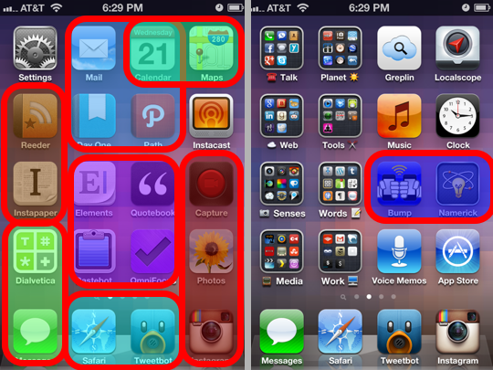
So here they are, my two main home screens:
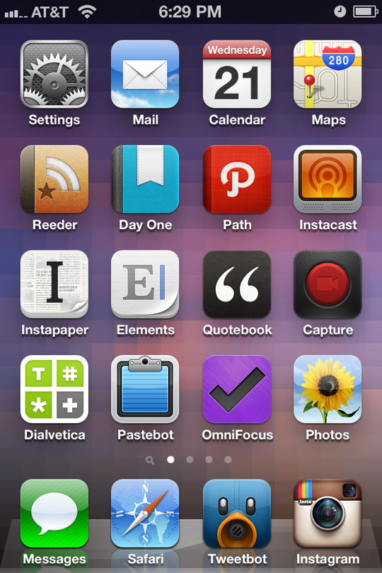

If you’re familiar with these apps, you’ll see that there’s some logic to which ones are next to each other. It’s tempered by how they look next to each other, though. This is just something for which you have to go with your gut. Like icons and like colors work best in some cases, contrasts work best in others. Use your own eyes to determine where you’ll find things most easily.
But where do you start? My suggestion is to start with the Dock. Determine which four (or three, or two, or one!) apps you want access to from every screen. The easy choices are the ones you use most, but that might not be true in all cases. I went with the ones that help me complete the tasks I’m most likely to want to do quickly.
Before iOS 5, the Camera app was where Instagram is, on the right side of the Dock, but the ability to launch Camera from the lock screen freed up that spot. You see how this works? It’s all about freeing up space for the essential apps.
Choose the apps that go in your Dock, but remember, you must also consider the aesthetics of how those apps look next to the bottom row on both screens. So now you’re already working on the rest of the apps. It’s useful to think of the spaces in terms of groupings of tasks. Here’s how I think of mine:
See how those go together? The colorful ovals represent the apps that need to be near each other for functional reasons. Everything else is where it is for either an ergonomic or aesthetic reason.
3.3: Fix your arrangement by feel and look.
Once you’ve got your apps basically arranged by function, the last step is to optimize how it feels and how it looks. For example, make the apps you launch most frequently the easiest to reach with your thumb.
The visual part is the most subtle. It may seem to be the least important part, but it’s the difference between confusion and clarity. Look at the way I used the emoji in the folder names on screen 2. (That outside/inside relationship was @atjamie‘s idea.) It lets your eyes scan right up the middle, and you have cues in your peripheral vision to figure out which folder is which more quickly.
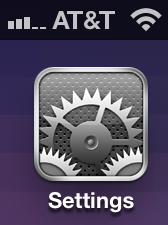
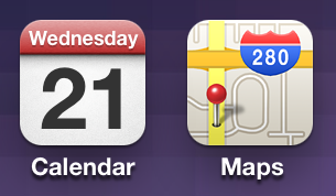
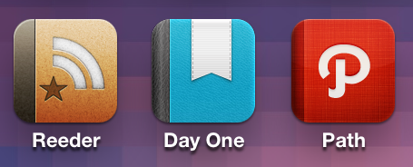
The final, crucial task is to make sure the icons look great together. That’s why a good icon matters. We’re done talking here; all that’s left is looking, so I’ll leave you with some close-ups of the visual relationships that matter most in my home screen arrangements. They’re the final touch.
Jon Mitchell is a writer at ReadWriteWeb during the daytime. You can follow him on Twitter, the only social thingy he really likes, @ablaze.
If you enjoy his approach to iOS devices, check out his weekly podcast, The Dock Podcast, which he co-hosts with AppAdvice writer Jamie Young (@atjamie). They talk about workflows and playflows for all kinds of people.
If, for some perverse reason, you’d like to keep up with Jon’s tweaks to his home screens (both iPhone and iPad), you can find them at homescreen.me/ablaze.

