After a long wait and a lot of promising tweets, App That finally released version 2.0 of its iPhone weather app Shine. The new version finally comes with international support and is now available worldwide, which means that I, as a European, can finally use it. So, I downloaded it, played with it and decided that I need to tell you guys about it. Because I love it!
Table of Contents
Yet another weather app?
I know, I know. There are hundreds of weather(-related) apps on the App Store, so why would I possibly want to care about another one. There are beautiful ones, minimal ones, information-rich ones, feature-packed ones and the iPhone even comes with its own weather app (and a widget, in iOS 5). Well, let me tell you — Shine combines all of the above (except the widget, obviously). It is beautiful, minimal, information-rich and comes with the best features a weather app should have.
The User-Interface
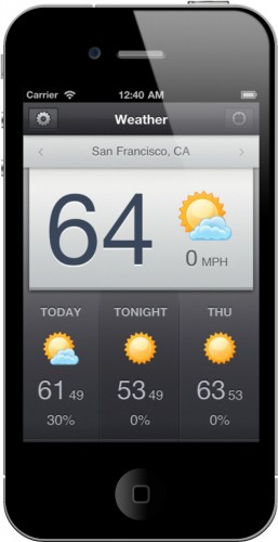
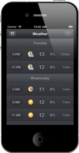
The main screen of Shine is divided into two parts. The top half shows you the current weather information for the set location. A big number shows you the temperature (in °F or °C, whichever you prefer), a little beautiful icon representing the condition (sunny, cloudy, raining, etc.) and the wind speed. The bottom half of the screen shows a three-column forecast, also giving you the above-mentioned information plus the chance of rain in percent. You can scroll to the right on that bottom part of the main screen to see the forecast for each day of the coming week. A scroll down takes you to the next few days’ forecast, giving you named weather information in a three or one hour interval (you can set your preference in the settings of the app).
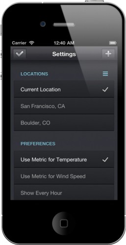
On the very top of the screen, you can access the settings of the app and set the location for which you want to get the weather information. The settings screen of the app is really simple and self-explanatory, giving you the option to choose between metric and imperial units and, obviously, to add new locations to your list.
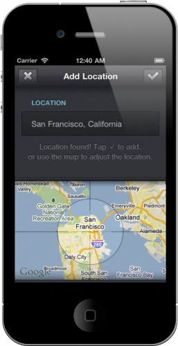
Even the screen to add locations is beautifully designed and comes with a neat little animation when the app searches for the place you entered. If it hasn’t found the right spot, you get a cross-hair like view on a Google map, which lets you then move to the location you intended.
The design
I’ve mentioned it a few times already, but I just can’t seem to stop talking about it. That’s probably because of all the wonderfully designed details throughout the app. From the little icons representing the weather conditions, to the use of font-sizes to indicate which number is the low and which one is the high temperature, the smooth animations when moving around the app and the mentioned cross-hair view to find the location you are looking for, this app is just perfectly designed and is a pure joy to look at. Apple couldn’t have done it any better. Quite literally, they couldn’t, because obviously they didn’t. And compared to Shine, Apple’s own weather app looks like Windows Vista (sorry for my language). Shine just looks perfect to me.
What’s Macgasmic
So, is it all about the design? Well, yes. And no. Being an Apple fan, I easily fall for beautiful looking things. And given the name of this website here and the fact that you are reading these lines, I’m probably not completely wrong when I assume that you like good design as well. But, why not use any other beautiful looking weather app then? Why not get one with nice animations or just stick to the one you use right now?
Good design has to go hand in hand with functionality to really make it stick out from the masses. It has to make put the features of something into the spotlight. And that’s what Shine does.
From my personal experience, Shine does it best of all the weather apps. It presents the necessary information in a beautiful way and doesn’t distract your eyes with fancy, unnecessary animations or text. When you want to check the weather for the day or for tomorrow real quick, you don’t really need a fullscreen CGI birds-eye animation flying through clouds or sitting at the beach, having to search for the actual temperature in the lower left corner, just tiny enough to still be readable without distracting from the animations. That’s the wrong way around. You want the design to complement the information. Clean, helpfully guiding, yet beautiful and nice to look at.
What’s not
As you maybe can tell from all the lines above, I don’t really have anything to complain about. Shine is one of those “What it does, it does perfectly well” apps. All it can do is show you the weather forecast, but this it does in a uniquely great design which kind of makes you want to look at it all the time.
The one thing you could criticize is the missing iPad support/app. Shine is an iPhone app, which means that you can of course use it on your iPad, but it won’t look as good. There is no iPad version, nor have I heard anything about one coming (or the app going universal) anytime soon.
I’ve been trying my hardest to find any bugs, but couldn’t. Reading App That’s Twitter stream, they were talking about fixing bugs and mentioned a few times that there was a problem with the way magnitudes and latitudes were handled, but I could not recreate that problem, no matter how hard and how many different places I entered into the search field.
All in all and wrapping this thing up, I have to say that Shine is by far my favourite weather app that’s ever been made. It has already found its way onto my homescreen (the app icon is pretty too!), and that I honestly find myself checking the weather forecast more since I have it installed on my iPhone. That is why I highly recommend you checking it out and clicking on the link in the App Store box below.

