Before yesterday, Microsoft had essentially let Windows rot into a steaming pile of garbage that most of us (Mac people anyway) wouldn’t want to touch with a ten-and-a-half-foot pole. It was horribly ugly, and had seen virtually no innovation in the last decade (or the last three).
Table of Contents
Back to the future.
Yesterday, we all got to see what happens when you awaken the sleeping giant in Redmond. Windows 8 is refreshingly innovative, even futuristic in its concepts. It’s clean, modern, fast, and streamlined. It’s well-designed. It has beautiful typography and a fantastic UI. None of these are things we have come to expect from Redmond. None. This is what Microsoft should have been doing all along, rather than wasting time imitating Apple. This is what happens when they think for themselves, and it’s actually pretty impressive. Perhaps the most important thing to take under consideration is this — this is what Windows 8 looks like, nearly a year before its release. Now, just imagine how much can happen in a year of full-force development. Microsoft is scheduled to unveil another round of features and improvements in September at their development conference (similar to Apple’s WWDC) in Anaheim, California.
Now, is Microsoft’s new OS perfect? Heck no. Microsoft made some fairly severe mistakes in its development, mistakes that should and could have been avoided. The single biggest problem with Windows 8 is that they built it on the existing core Windows operating system. This means that all of the existing problems with viruses, malware, spyware, Trojans, and other nuisances will most likely persist on Windows 8. Likewise, Registry problems and DLL issues, along with painfully bad installation procedures, will also likely stick around. So, essentially, in spite of all of these fantastic innovations that Microsoft has done with Windows 8, at its core it’s still the same rotten apple. Time will tell if Microsoft manages to find a way to fix all of these problems.
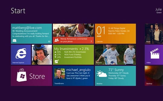
On the surface, however, Windows 8 is downright impressive. The good news is that impressive side of Windows 8 happens to be the side that everyone will be most exposed to. This is great news for Microsoft, and for everyone for that matter. Windows 8 features a beautiful new tile-based UI paradigm that is radically different from anything they’ve ever done on the desktop before. It’s directly inspired by Windows Phone 7’s UI, and really feels like Windows Phone 7 has been scaled up to the desktop. For years, I’ve been saying that Microsoft desperately needs overhaul Windows’ user interface, and it’s really great to see that they’ve finally done just that. I’ve also said that if they really wanted it to be successful, that they should simply have the Windows Phone 7 team design the user interface for Windows 8 on the desktop. And they’ve done just that.
Tiles
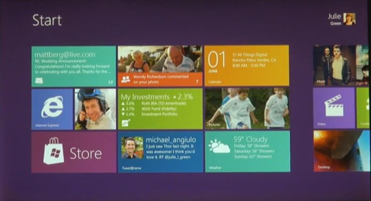
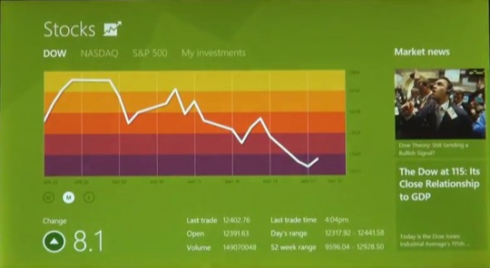
The tile UI concept has been a long time coming. I’ve used Windows Phone 7, and the concept of tiles works better in practice than the concept of icons as used on virtually all other operating systems. This is because tiles can convey more information by definition. For instance, your e-mail tile shows a simple email icon, but also shows the actual title and sender for your last few emails. Your twitter app can show you the most recent reply or direct message, directly on its tile. Your calendar app can show you your next appointment, and your weather app can show you the current weather, along with the forecast for the next few days. Facebook can show you how many notifications you have waiting, and your messaging app can show you your latest text message. This same concept applies to photos, videos, music, contacts, and a very wide variety of apps, all of which find their own ways to display useful information at a glance. Furthermore, the tiles are dramatically easier to touch and manipulate on-screen than small icons are. I can see this user interface scaling really well to the desktop as well, because easier click/tap targets are better just about everywhere, and everyone likes to see vital information at a glance. This is something that applies equally well on multitouch devices and older keyboard and mouse-based devices as well.
Apps and Multitasking
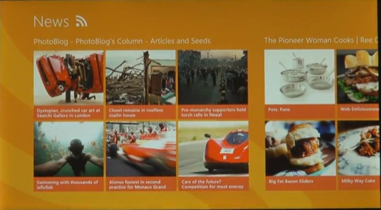
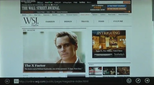
Apps in Windows 8 now have virtually no chrome (user interface elements) whatsoever. This means that things like toolbars, window borders, drop shadows, and all sorts of other space-consuming things have been completely eliminated from the interface, which results in much higher information density. The entire user interface feels like something out of Tron Legacy or some other sci-fi movie. It’s great in that regard.
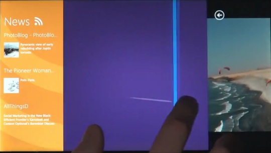
Microsoft took the unique multitasking approach of combining the full-screen app concept from Apple’s iOS with the concept of a tiled window manager. To display more than one app on the screen at a time, you simply begin to drag an app onto the screen from the side by swiping your finger or dragging your mouse, and then pause over the area that you want it to occupy. The app is automatically scaled to fit the vertical height of the screen, leaving enough horizontal space to the right or left for other apps.
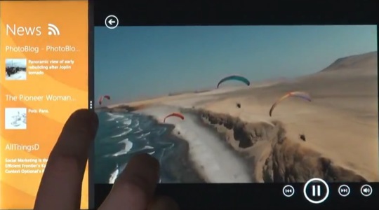
This other space is initially occupied by whatever app you were using before you brought the new one onto the screen, but can also be shared with a third app if you drag yet another onto the screen. This makes excellent use of screen real-estate, with virtually zero wasted space, and very organized information. This is very reminiscent of futuristic user interface concept videos we’ve seen floating around the Internet, and it appears Microsoft was paying attention.
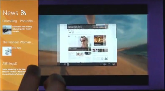
Where it gets really weird is when you need to use what they call a classic Windows app. It’s as if you were able to use an OS 9 application on your iPad, right inside of iOS. Windows 8 has a feature that allows you to turn one of your app spaces into a traditional Windows desktop, complete with task bar and traditional Windows 7-style Windows. This allows you to run apps from 10 years ago right alongside these slick, futuristic “Metro” apps that are built for Windows 8. Of course, I’m not sure bringing the last 20 years worth of Windows’ baggage into the future was a bright idea. All the weaknesses that were left in Windows 8 merely for classic app compatibility will likely turn out to be a nightmare for Microsoft’s developers and users in the long run. We’ll have too see how that pans out.
What if…
What I really think Microsoft should have done is this. Toss the entire core Windows OS (DLLs, Registry, Virus vulnerabilities and all) out the window, and start from scratch with a UNIX based kernel and core OS. Then, simply implement Windows classic via a built-in dedicated VM (created by Microsoft for this purpose, with performance in mind), in much the same vein as VMWare or Parallels. This model would allow a user to have his classic VM infected with a virus, trojan horse, or other nastiness, and simply hit a “reset classic” button that would reset classic by replacing its disk image with a restore image stored somewhere on the machine. Maybe I’m missing something, but this seems like a far more logical way of dealing with the need for classic support than keeping the entire mess of Windows around for the ride. I’m sure performance in demanding apps such as games was cited internally as a reason for doing this, but the disadvantages seem to far outweigh the benefits in this case.
How does it stack up?
How does this stack up to Apple’s offerings? Good question. In my opinion, the UI makes OS X look rather antiquated (and I’m writing this from within Lion). Windows 8 feels very mature, clean, and minimal. OS X feels very polished, but very traditional. It’s as if Microsoft jumped 10 years into the future, and had a peek at what Apple’s OS offerings would look like then. OS X has kept the same UI concepts that were standard in System 1, way back in 1984. We still have the desktop, icons, menus, trash, windowed apps, close/minimize/zoom buttons and all. Nothing fundamental about the Mac has really changed that much in the last 25 years. iOS has some real promise, and Apple is clearly bringing some solid innovations from iOS to the Mac, but what Microsoft has done feels a lot more robust. Of course, Apple’s quality, attention to detail, and user experience remain unparalleled. Additionally, OS X is time-tested and proven, while Windows 8 may end up being one of those things that looks great in a video, but performs poorly in real life. However, if Windows Phone 7 is any indication, that isn’t likely to be the case. Windows 8 feels like something that would be released alongside OS XI, not OS X. I’m sure Apple has a ton of great stuff up their sleeve for the future. This bold move by their biggest and oldest competitor can only push them to release more, better, faster, and sooner. This, of course, is a really, really good thing for all of us. Apple has produced some really amazing stuff while Microsoft sat around and did nothing. Just imagine what Apple will produce when they’re thrown into a race to the future with their fiercest competitor.
Where does this leave Google?
What about Google? Well, I think Chrome OS stands a decent chance in the enterprise, where many computers act as dumb terminals to give access to a cloud-based solution. The pricing and remote management features of Chrome’s OS and new ChromeBooks will also both remain compelling for business and education buyers.
In the consumer desktop OS market, Google is screwed. It is unlikely that any educated person would buy a Chrome OS-based PC with Windows 8 and Lion being their other two options. I’m not saying Chrome won’t sell — it may do well — in the enterprise, government, and education markets. But on the desktop PCs that now sit in homes all over the world, Windows 8 will eat Chrome OS for lunch. Microsoft is back, baby. And they’re better than ever.
In Closing
With Apple’s Lion, Microsoft’s Windows 8, Google’s Chrome OS, and HP’s WebOS all arriving on the desktop within months of each other, this is going to be one heck of a year. It looks like we’re headed back to the future. This is going to be good.

