Michael Spiegelman and Chris Jaffe, the guys leading up the mobile versions of the Netflix streaming player, just posted on the official Netflix blog about the latest update to their iOS app.
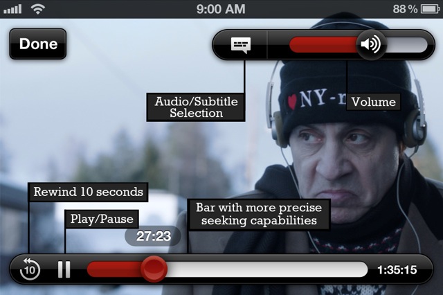
In the 2.2 release, available right now in the App Store, they focused on refining the user interface. They’re unifying the look and feel of the browsing mode across their mobile platforms, which could either end up being very good or very bad. If we end up with vague, generic design instead of iOS-optimized design, the quality could certainly plummet to Android levels. The bigger, wider-spaced video controls are certainly a welcome tweak, though. Also updated, the scrub bar now shows thumbnails as you scroll, and subtitles and audio selection are now easily accessible from the player interface. Nothing to complain about there.
If you’re a Candian Netflix fan, you also gain a “Do not share” setting to prevent the app from spamming your Facebook account. Mazel tov!
Official Release Notes:
- A look and feel more consistent with the Netflix browse experience in our mobile applications
- Larger, more separated play controls appropriate for how people use these devices
- Better exploration during video play with thumbnail images on the scrub bar
- Easy access for audio/subtitles settings and other existing player features
- In Canada we also added easier “do not share” capability for Facebook-connected members


